It’s finally here. The thing I have been advocating for through my work, writing, videos and talks for years. A swing of the pendulum. A reemergence of fun in visual design. I have been waiting 7 years to write this.
With the redesign of macOS 11 Big Sur, Apple has made many interface changes and updated the appearance of apps. Materials and dimensionality has made its way back into the interface —and every single app icon for every application and utility that Apple ships with macOS has been redesigned with depth, textures and lighting. This is a big deal. Probably bigger than what most people realise.

As with all big shifts in design, you’re going to get a lot of noise. People will try to co-opt this new direction and attempt to label it as something it’s not (looking at you neomorphism). People will find fault with the execution. People will disagree that there’s even a change. There’ll be snark. There'll be a period of adjustment. There’s a lot to talk about— but I think most of it misses the point.
This is a philosophical change in the role of visual design and one some of us have been working towards for a long time. It’s just the beginning, but I think we’re on the cusp of a new era.

How We Got Here
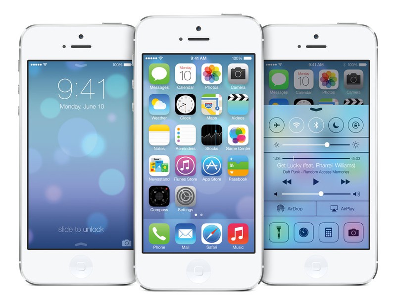
To truly understand this change, you need to understand where the pendulum swung when iOS 7 was introduced in 2013. You’ve heard this story a million times from me, but here it is condensed: iOS 7, with its minimalist ui, white space layouts and magazine typesetting represented a shift in the role that visual design had to fulfil.
Under the rule of minimalism, visual design for the sake of design took a backseat. A successful interface was one that visually didn’t call attention to itself. The fewer visual embellishments an interface had, the more effective and clean it was considered. As little interface as possible, was the best interface.
In many ways, the great flattening of our interfaces was an obvious reaction to the skeuomorphic era that came before it. It was the industrial designers’ dream come true. The Jony Ive-ification of the digital surfaces around us.
This idea that we could throw off the silly follies of using real world cues to evolve the abstract interface to its simplest form. That the interface had a natural evolution and that minimalism was the next logical step. Under this philosophy a designer’s job was to most effectively, and with as little complexity as possible, communicate a feature or get users from a to b.
It was also the great democratisation of design. With the bar lowered for visual design, the industry became far more approachable and a new (far larger) generation of designers came of age that held minimalism in high regard. New tools sprung up to service them and a cottage industry of design-titles (UX Designers, UI Designers, Interaction Designers, Brand Designers, Product Designers) dotted the spectrum of putting pixels on screens.
It’s easy to be enamoured by the story of the evolved interface. It fits so well with other narratives of human progress. And it’s hard to argue that it wasn’t time for a shakeup and a new paradigm around the time iOS 7 came out. I don’t think there’s anything wrong with striving for simplicity as one of the pillars of design. The problem arises when it becomes the only pillar.
Here’s what I wrote in my 2018 post “Bringing back Skeuomorphic Design”
There’s a great deal of sameness in design these days and I think we can challenge that if we’re willing to let go some of the minimalist ideals and start thinking about how we can infuse our designs with fun. Start thinking about form instead of just function. Allow ourselves to embellish in the name of orchestrating an experience. Delight as a differentiating factor."
People who have been following my work will hopefully recognise some action behind these words. Most of what I produce tries to live up to this, and I’ve been lucky to find clients that still wanted this brand of design. People who have watched my YouTube videos or sat in my icon design workshops or heard one of my talks have all been exposed to this brand of thinking. A pursuit and rekindling of fun in design.
I think the problem with minimalism as the overarching goal of visual design is the restraint it puts on emotion. When your goal is to take away as much as possible for it to be as effective as possible— it leaves very little room for expression. This intersection between art and design is a hotbed for discussion and something we’ll probably be discussing long after I’m done pushing pixels.
Since the release of iOS 7 Apple have walked back some of the more stark minimalistic choices. Text labels became buttons again, subtle gradients returned and tactility crept back into our interfaces.

We’ve seen a lot of people produce balanced work that falls somewhere between the skeuomorphic heyday and the flat minimalism. Yet, iOS 14 still remains largely flat. Icons are glyphs on colored backgrounds. Realistic lighting and shadows in app icons on the platform are still largely done to stand out rather than fit in.
The Comeback
With the redesign of macOS 11, Apple had an opportunity to carry forward the minimalism that still prevails on its other platforms. Many suspected that some visual unification would take place and that the minimalism Apple themselves had championed would swallow up any last vestiges of realism or expressiveness in visual design on the mac.
And why not? Apple doesn’t strike me as a particularly sentimental company and we’ve seen them make these sweeping visual changes before. But then WWDC 2020 live-streamed to millions of people and there was macOS Big Sur, redesigned with all new icons and rules for a ‘lifelike rendering style’.

From the newly released HIG:
Although the design language strongly encourages visual consistency, it doesn’t preclude judicious expressiveness. For example, the Preview, Xcode, and TextEdit icons continue to combine depictions of the physical objects that best convey the app’s core purpose, while incorporating the new shape, perspective, and shadow.”
They’re squircles alright, which brings them inline with the other platforms, but they also feature things like materials, lighting and radiosity. Some of them depict physical objects in a style that can only really be called skeuomorphic.
We all instantly had a lot to say about the execution of the specific icons (myself included), but let’s forget the execution for a moment and think about what this means for visual design as a whole.
What Apple is essentially saying here is that “judicious expressiveness” is allowed. A lifelike rendering style is encouraged.
To really understand the impact this will have, you’ve got to appreciate how influential Apple design is in the larger design industry. Being the native platform for most creative people in the world, the interface design of iOS and macOS is what’s staring back at us every day. As clearly proved by the paradigm shift that iOS 7 and flat design exercised on everything from apps to icons to websites— what Apple does matters.
Given the chance of a redesign on the mac, Apple did not choose minimalism as the single guiding design pillar. In fact, they doubled down on expressiveness, added depth, gaussian blur shadows, angled lighting and real lifelike objects. Sure, it’s not consistent and we lost some expressiveness elsewhere (🥃 pour one out for detailed toolbar icons), but generally this is like a green light turning on for more expressiveness and ultimately more fun in visual design. They didn't just keep this for nostalgia's sake, they developed it further. They advanced it and are pushing it out to millions of Mac users later this year.
With this approach Apple is legalising a visual design expressiveness that we haven’t seen from them in almost a decade. It’s like a ban has been lifted on fun. This will severely loosen the grip of minimalistic visual design and raise the bar for pixel pushers everywhere. Your glyph on a colored background is about to get some serious visual competition. If you don’t believe me, it’s now one week after WWDC and dribbble is overflowing with app icon redesigns and I’ve seen at least 3 major icon sets in the works (remember replacement icon sets?). Yes, I'm working on one too.
Even if Apple never intended for this style to make it into, say, the native icons on iOS or iPadOS, we’re going to see it spill over around them. Since the announcement I’ve gotten daily inquiries into my app icon design services. From my seat right now, it truly does feel like the dam has broken. How big of an impact the wave is going to make and how far it’ll travel is uncertain, but it’s certainly here.
There’s a lot of other interesting perspectives to this that ultimately could merit their own articles. There’s a generation of designers that wasn’t brought up on this pedigree of visual design. How do we train them? In just the past week I’ve seen many people try to make Figma, XD and Sketch do things that they’ve never done with it before. Will this generation switch back to Photoshop? Is Adobe about to have a field day?
There’s also an interesting thought about the reasoning for doubling down on this dimensionality and realism and it has to do with AR. Flat minimalistic UI and iconography doesn’t blend well into the real world. Sharp corners feel threatening in human scale and so we’re being directed towards softer, rounder, approachable designs that will more easily make the jump to a mixed reality in a post-Apple-glasses world.
The cynics will say that the pendulum will swing back to flat in a few years and that it’s all part of the cyclical nature of design trends. I don’t think the pendulum swings all the way back. Sure, there’s an aspect of fashion to design—what’s in vogue today won’t be tomorrow—but I think this is more about the scale balancing out than it is the pendulum swinging back. Fun and “judicious expressiveness” is back to stay—not because fashions have changed but because it has value. It took us losing it to realise that.
For now at least, as someone who has been advocating for more expressiveness and fun in visual design for years, I couldn’t be more happy for the comeback. I’m excited to see what fun it’ll bring.
— @flarup