Late last year Google revealed their new guidelines for Android Launcher icons, or ‘Product Icons’ as they are now referred to. It is a fantastically well documented effort to more strongly guide designers towards a unified visual language and it is probably the best thing to have ever happened to icons on Android. It is therefore way overdue that I launch a new template for Android Product Icons. Members can go right ahead and download the template here, or read on for a bit more in-depth on the main differentiators of Product Icons on Android.

Constraints is a natural law when working with icons and for many years icons on Android has been an outlaw wasteland. This has in large part been because of a lack of constraints and a unifying set of enforceable guidelines. On iOS we’re all bound by the squircle and, with no transparency allowed, designers are funnelled into a more streamlined canvas. If you’ve ever designed an icon for any version of Android you’ll know that you’re allowed to do basically anything you want within those 512×512 pixels. With no restriction on the alpha channel every conceivable shape and effect is to be found throughout icons on Google Play. A few fledgling standard sizes and shapes within those vast transparent canvasses have been attempted but even Google themselves have changed their minds on more than one occasion. So freedom is good, right? Not when you’re looking at it from a user experience consistency stand point. Having shared similarities between icons create a much more pleasant, scannable and relatable OS. Google knows this and Google has taken great strides in cleaning up the micro cosmos that is 3rd party Android apps with their well documented material design guidelines. Icons are now also a part of that effort and with an updated template, I hope to make it easier for you to be part of that movement too.
So how does the Android Product Icon guidelines help Android developers unify their icon designs? Through a series of guides on several aspects. Rather than paraphrasing the entire (and very excellent) material design product icon style guideline, I’m going to focus on a few things that my template will also help you with. When you’re done reading this you should understand the core concepts that make up product icon design and how this template will help you master those.
Grid and Keyline shapes
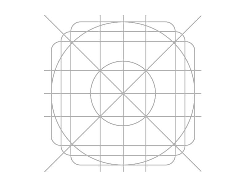
The grid for Android Product Icons not only help guide the composition of elements inside an icon, it also outlines the core keyline shapes. In the new template you’ll obviously find the grid system to guide you in your layout but you’ll also find pre-rendered base shapes of the square, circle, horizontal and vertical rectangles. Each keyline shape described in Google’s material guideline and each shape available as individual folders in the template.
The standardized Android Product Icon Keyline shapes, all bundled in the latest template.The standardized Android Product Icon Keyline shapes, all bundled in the latest template.
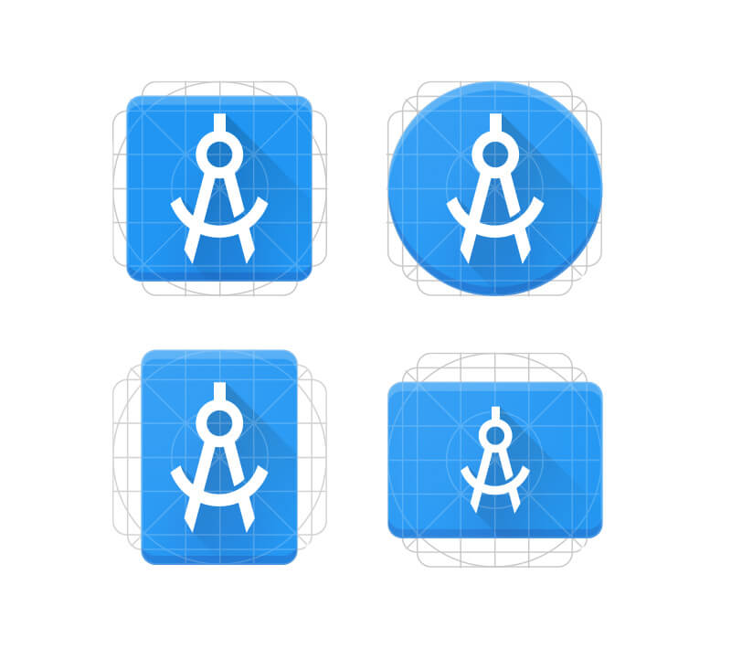
You don’t have to follow these shapes, but it’s a great start and probably serves as one of the strongest sources of consistency across icons created under this new direction. Building off one of these basic shapes will, right from the get-go, lend some legitimacy to your icon. It will naturally fit in with other icons paying homage to the new grid and create a greater sense of cohesion. As described above, both a strength and a weakness of Android app icons is the ability to create unique silhouettes – something that we’re unable to do on iOS. It’s a strength because the designer is less restricted in pursuing novel concepts that can more easily stand out. It’s a weakness because it opens the door to visual fragmentation. The grid and the keyline shapes is Google’s way of trying to bridge those two opposites. Transparency is still fine and you’re still free to do whatever you want but here’s a guide and standardized shapes that will make your app feel part of the visual universe.
Lighting & Colors
The design approach is inspired by the tactile and physical quality of material. Here's a Physical prototype, Lighting study, material prototype and color study (from the material design guideline)The design approach is inspired by the tactile and physical quality of material. Here’s a Physical prototype, Lighting study, material prototype and color study (from the material design guideline)
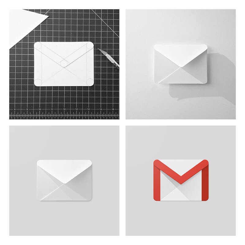
The very core of material design is tactility and the subtle physicality of things. For most intents and purposes this is achieved through lighting. Google uses the analogy of paper that is cut, folded and lit.
"The quality of the material is sturdy, with clean folds and crisp edges. The Matte-like finish interacts with light through subtle highlights and consistent shadows.” – Google
This gives birth to a generally predictable lighting pattern; a subtle drop shadow directly underneath components, followed by the now-famous long shadow. Usually a 45 degree gradient going from black to translucent black dropped down to about 20-40% opacity. These are all layer styles that can be found inside the template so you can build your own shadows.
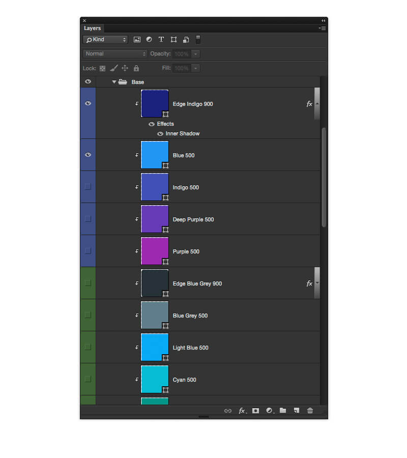
The infamous long shadow also bundled as a style in the PSD.The infamous long shadow also bundled as a style in the PSD. Furthermore the color scheme is neatly organized and you don’t have to spend long looking at the impressive presentation of the palettes to appreciate the amount of work and care that has gone into selecting those. The Android Product Icon template comes bundled with the 28 base colors combined with the 5 core shadow colors and white for tint.


The above is the suggested colors for Android Product Icons from the icon section in the material guidelines.
"The top and bottom edges of material elements provide a sense of depth and surface” – Google
Material edges each has a 1dp thickness of 20% transparent tint (from above) or shade (from below). The color scheme dictates what tints and shades go with what groupings of colors. All of these are bundled with the template as separate masked layers that can be turned on and off for easy experimentation.
Most icons feature a very subtle finish consisting of a virtual 45 degree light source. It extends from the top left corner to the exterior edge of the icons silhouette. This is provided as a single clipped layer in the template so that you can easily apply it to your own icons.
Geometry & Anatomy
It’s worth taking a look at the preset standards that have been determined for each specific keyline shape. A series of circles, squares, rectangles, orthogonals and diagonals make up a small palette of elements attempting to unify the geometric visual language and systemize their placement on the grid.
Learn the geometric language to create visually cohesive and consistent experiences.Learn the geometric language to create visually cohesive and consistent experiences. Because of the very physical approach it makes sense to think about the anatomy of the icon and how each component is constructed on top of other components in the icon. Google describes the classic construction of icons as a set of layered components:
- Finish
- Material Background
- Material foreground
- Color
- Shadow
It’s worthwhile to familiarize yourself with these elements and Google has a very neat breakdown in the guidelines.
There are a lot more in the official guidelines and I suggest you go over that before creating your masterpiece. Google has done their homework and produced a stellar design document that sets down rules for a much more streamlined environment of icons on the platform. The PSD template I’ve provided gives you a foundation that makes it easier to build from with the obvious added benefit of what you’ve come to expect from these templates; smart object scaling, environment preview and one click action exporting of all sizes. The old template was long overdue for a refresh and hopefully this one will help empower Android iconists to start producing fantastic little gems under the strong guiding hand of the Google material guidelines.