Creating a logo is design distilled. You need to make this little piece of branding that forges a connection with the people who come into contact with it. I find that challenge immensely fun. You get to be the storyteller of a brand. You get to help shape many people’s perception of an entity. You get to make a difference for someone– all with the use of your creativity.
![]()
A lot has been written about logo design and it’s no coincidence that a lot of the tips you’ll encounter from professionals sound alike. There’s some universal qualities to good logo design that span different approaches and styles. I have been designing logos for my own projects and for clients for 15 years now and I’m often asked about my process and what I think makes a good logo. So here’s some of the aspects I always try to consider when I design logos.
Make it Simple
Simplicity in logos has a huge impact on some of the other aspects that make logos great– like flexibility, scalability & recognisability. It’s not that all logos that are simple are great or that all great logos are simple, but when you start with the basics you’re usually on a safe path. I almost always start out with plain geometric shapes when I’m exploring concepts and then build stories on top of those. It’s important to point out that by simple, I don’t mean plain. I have long been a proponent of “fun” in design, and looking at my work I think it’s clear that I enjoy embellishments and gratuitous detailing. No, by simple, I mean that the concept shouldn’t be cluttered by multiple objects or complex layouts. You should strive for conceptual clarity. If you can keep things simple and still meaningful you can usually make the other aspects of a good logo design fall into place.
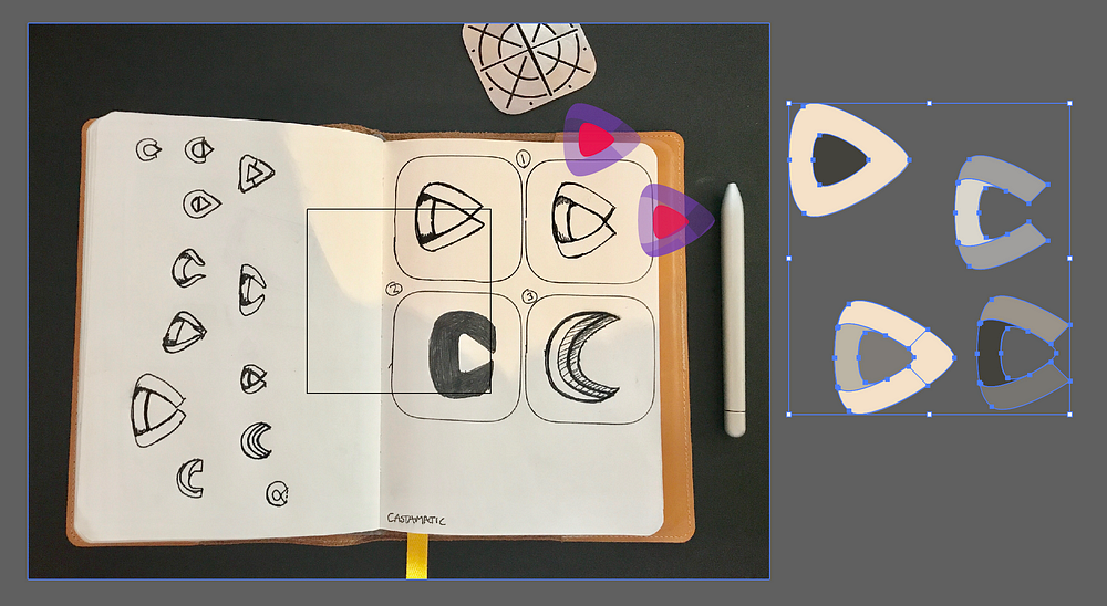
 When I start designing a logo (much like when I start an icon design) I always fill up a sketchbook with various shapes and ideas. Once I have a few core shapes I like, I bring them into Illustrator and draw on top of them. This leaves me with a bunch a vector shapes that I can continue to refine.
In the video below I talk a bit about the role of Sketching in my creative process and why I think it’s such an important step. The video describes the process of making an Icon, not a Logo (those two things are not the same), but the sketching part is identical.
Make it Usable
A great logo is one that you can actually use in many different contexts. Like with most other areas of design, functionality should be at the core of a good logo. Design for variety. Envision your creation in digital, print & motion — with or without a typeface. I personally like to make logos that make great stickers and that people would want to put on their laptops. But a logo should also work with less fidelity and I always create both detailed and uni-color versions of my marks. Your logo needs to be flexible and work on everything from the top of your website, in your app, on your t-shirts or at the end of your video material.

Make it Recognisable
One of the most elusive qualities of good logo design is recognisability. Making something that people see and recognise. To excel at this particular attribute you need to balance two (sometimes) opposing forces: doing something that feels unique and doing something that feels simple. Most simple things are not unique, and have been done before. It’s a conundrum that most designers will find themselves in at some point.
Making something that is recognisable is helped greatly by doing something that is either not too complex, or — on the other end of the scale — something that has a unique style or story.
Just realise that when it comes to judging wether or not something is recognisable, you’re staring through the haze of having looked at it (and its many variations) for a good while. In other words: the process of making something can make you blind to how recognisable a design is. I always try to ask people around me to give me their initial gut reactions.
Make it a Story
To me, a great logo is more than just a pretty mark. There needs to be a story, some deeper connection to the material and what you’re trying to convey. The best logos invoke some feeling in the viewer and has a little wink-in-the-eye or aha-moment built in. I personally like to infuse my logos with my own personal interests. If I can get a little bit of me in there– a little bit of 80’ies radness or quirky humor, it’s a good thing.

In my opinion, the best logos are the ones who satisfy all of these criteria. At the end of the day, your most important task when designing a logo is to create something that makes you happy when you look at it. Something that is both satisfying to behold and contextually useful – leaving viewers with a lasting impression. It’s no easy task but it is one of the most satisfying design disciplines.
