One of the most common misconceptions in client/designer conversations is the frivolous way the term icon and logo is exchangeably being used. To alleviate this lets look at what an icon is, what a logo is and how these two things could come to be confused.
What’s an Icon?
Apart from any religious denotations an icon is a graphical representation of a concept or operation. We use icons to bridge the understanding of abstract analogies and practical use. Icons can be used to illustrate an entire application or individual operations within that application. In short, icons help us understand and recognize concepts that might otherwise be pretty hard to grasp.
I could write a very long article about the whimsical nature of icon conventions and the semiotics that guide these, but in this case it’s more relevant to look at the technical differences that is so fundamental for icon design and how these differ from logo design.
Icons are not Scalable
More often than not the end product when creating icons is not scalable. The very idea of icons are to best convey a given message within a predetermined confined visual space. In today’s icon-centric interfaces we allow for multiple variations of the same icon. The icons that are sitting in your dock most likely have at least 5 different states embedded, making them appear crisp in all aspects of your interaction with them. List view in OS X gives you the 16×16 pixel version while the dock uses the 256×256 pixel adaptation. These are not scalable vector versions, they are handcrafted raster masterpieces. The creator must carefully select how to best take advantage of the canvas in any given size and more than often completely recreate the icon in those sizes.
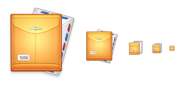 My manilla mail icon in it’s various states. Note the different layout of the elements in the smaller sizes.
Icons are Quadratic
Far the most icons operate within a complete square canvas. How you choose to employ that canvas is up to you, but it’s restricted to that straight edged space.
So that’s it. Icons are most often not scalable, they’re handcrafted raster imagery born from the desire to objectify an operation or a concept within a confined visual space. How does this differ from a logo?
What’s a Logo?
A logo is a graphical element like a mark and/or a carefully arranged typeface that together forms a visual representation of an entity, organization, product, tree hut, secret club or a billion other things. There’s an infinite amount of ways to think about logos and logo design but for the sake of this argument the important thing again is to look at the technical differences from icon design.
Logos are Scalable
As a representation that spearheads an entity’s entire brand a logo should be replicable across many forms of media. Logos need to work well on everything from letterheads to billboards from screen to print and they’re commonly not crafted to be viewed at a single optimal size. This multifaceted job has great impact on the sort of mindset you need to bring when designing logos. A proper logo package includes strictly vectorbased output and more often than not, a graceful degeneration of colours all the way down to a uni-color version.
 Logos are, more often than not, scalable.
Logos have no boundaries
In theory a logo could be anything. Other than the obvious benefits of working in a format that is easily scalable and replicable there really is very little rules compared to icon design. Icon design is very influenced by technical dimensions and the restrictions of the systems that display them. Logo design is a completely different venue. A logo could be any shape, colour or dimension – it can be waved from a 100 feet banner or tattooed on a butt cheek. It’s only constraint is that of the physical media that will display it.
Why are we confused?
Icons have taken a very prominent role in modern interfaces and this has obviously spilled over to the realm of branding where many icons serve both as application icon and branding for that entity. In the age of app icons where services and products are recognized by millions by their tiny real estate on their smartphone home screens, the lines between icon and logo are understandably blurring.
![]() Panic creates excellent software and uses their application icons as product branding.
Panic creates excellent software and uses their application icons as product branding.
This wave of iconism™ (yes, I just invented that for this purpose) has influenced many graphic designers and a lot of the appealing aspects of the cartoony and crafty iconized style has made its way to modern logo design trends. In fact this style became the poster child for the web 2.0 movement, and such many companies have logos that uses the same visual vocabulary as icons.
 Logos inspired by an Iconistic style.
And while logos can certainly employ an icon-like style, and even mimic the quadratic nature of icons, let there be no doubt; Icons and Logos are two completely separate design disciplines. It’s important to know the difference between these two things, as they inherently seek out to fulfil two very different goals, both technically and conceptually.
A lot of people use the terms exchangeably. While Icons, particularly app icons, can share branding-like qualities with logos it’s important to understand that they’re distinctively different design disciplines. Icons in the computer age are most commonly a representation within a confined squared canvas. They’re designed to solve a specific communication task at a specific size. While some of these things could also be said about a logo, more commonly logos are scalable and under no such restrictions. This distinction might not be very important for the end user. But for the designer creating an icon for something and creating a logo for something is two entirely different processes, potentially different tools, restrictions and deliverables. So next time a client casually mentions he wants in ‘App Logo’, make sure to correct them.