Gone is the old radii that we’ve all designed around for few years and here to stay is an entirely different and more complicated shape; The superellipse or, more precisely (and way cuter), the Squircle. Since the reveal there’s already been a dozen templates or so that have tried their hand at the new form and I have yet to see an exact representation. This is one of those things that seem very simple, but is actually quite hard to get exact.
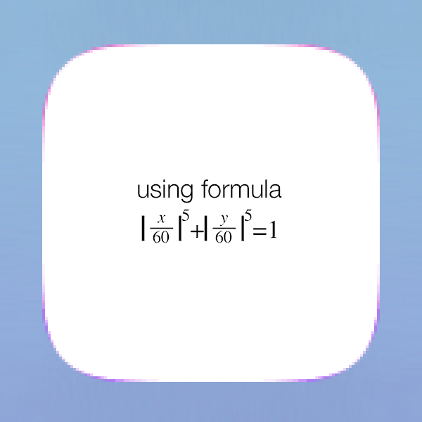
 The formula for the superellipse as proposed by Marc Edwards.
The last few days I’ve been collaborating and discussing this very topic with some very talented people on twitter. Marc Edwards, Photoshop guru, has put forward the above formula as the exact mathematical proportions of the new shape. Unfortunately we’ve been less than successful at converting that formula into an exact and usable vector shape in illustrator and photoshop. This is partly because the fidelity of the curve isn’t good enough when converted into a working vector file. As you can tell from the below experiments the sheer amount of points is less than ideal and the curve simply doesn’t seem to hit the exact outline of the iOS 7 icons when superimposed.

A lot of people have been trying to crack this over the past week or so, from the mundane attempts using round rectangles to the more adventurous attempts at hand editing an SVG file. To my knowledge, the exact outline used in iOS 7 icons haven’t been reproduced yet. We’ve had some very very close approximations, but not an exact outline.
 Heres a selection of the templates that currently exists out there, look at that rainbow of variation. None of us have the right answer.
The Golden Ratio
A few people have been working on reverse engineering the new icon grid that was introduced with iOS 7 last week in the hopes that it would unveil some secrets. This grid is (supposedly) build on the golden ratio and people like Alexander Ustinov have put forward some of the more exact outlines based on this theory. After having tried my hand at every possible method out there I managed to build my own golden ratio grid that have yielded the most exact outline I’ve come across so far. This is the shape I’ve used for the App Icon Template 3.0.
 The golden ratio grid that I’m using for my shape.
Now it’s important to say right up front, that this shape is an approximation. As you can tell from the below gif it’s a close fit, but no cigar. Everybody seem to have build different grid systems and ended up with variations on the curve. On top of that, our only way of measuring correctness is by superimposing our meticulously calculated shapes on top of screenshots and png masks found in iOS 7 to see where the shapes overlap. Not exactly the best way of verifying!
It’s silly to think that something this simple (and vital for our design efforts) can be this hard to get exactly right. However, I feel the above shape is ‘close enough’ to be usable. If, or rather when, someone cracks this with an exact vector outline, I’ll obviously update the template. It might very well be that there’s a simple solution that we’ve just not found yet.
 Graphic supplied by @marcedwards.
Why is this important?
Some of you are probably asking why all of this is important, seeing as Apple is the one rounding off the icons in the end. Well, having a solid and exact tool for creating icons have a very real world impact on what sort of designs we can create. If we have the exact rounded corner mask we’ll be able to create designs that utilize the edges of the icon. Essentially the more precise our guides are, the more control we have over the final result. Until the mathematically exact shape shows up, I hope you’ll find that the work put into this brings you close enough.
Update: Since this post was originally written, we’ve got our hands on the original shape that Apple uses. In the latest versions of the iOS App Icon Template, you’ll find the exact squircle shape.