With the release of iOS 18, Apple has introduced new opportunities and challenges for app designers. One of the most significant changes is the introduction of dark mode and tinted app icons. These updates provide new ways to make apps more visually cohesive across various themes and user preferences but also requires developers and designers to deliver a total of 3 different variations on app icon designs to best take advantage of these new options.
New Dark mode and Tinted app icons
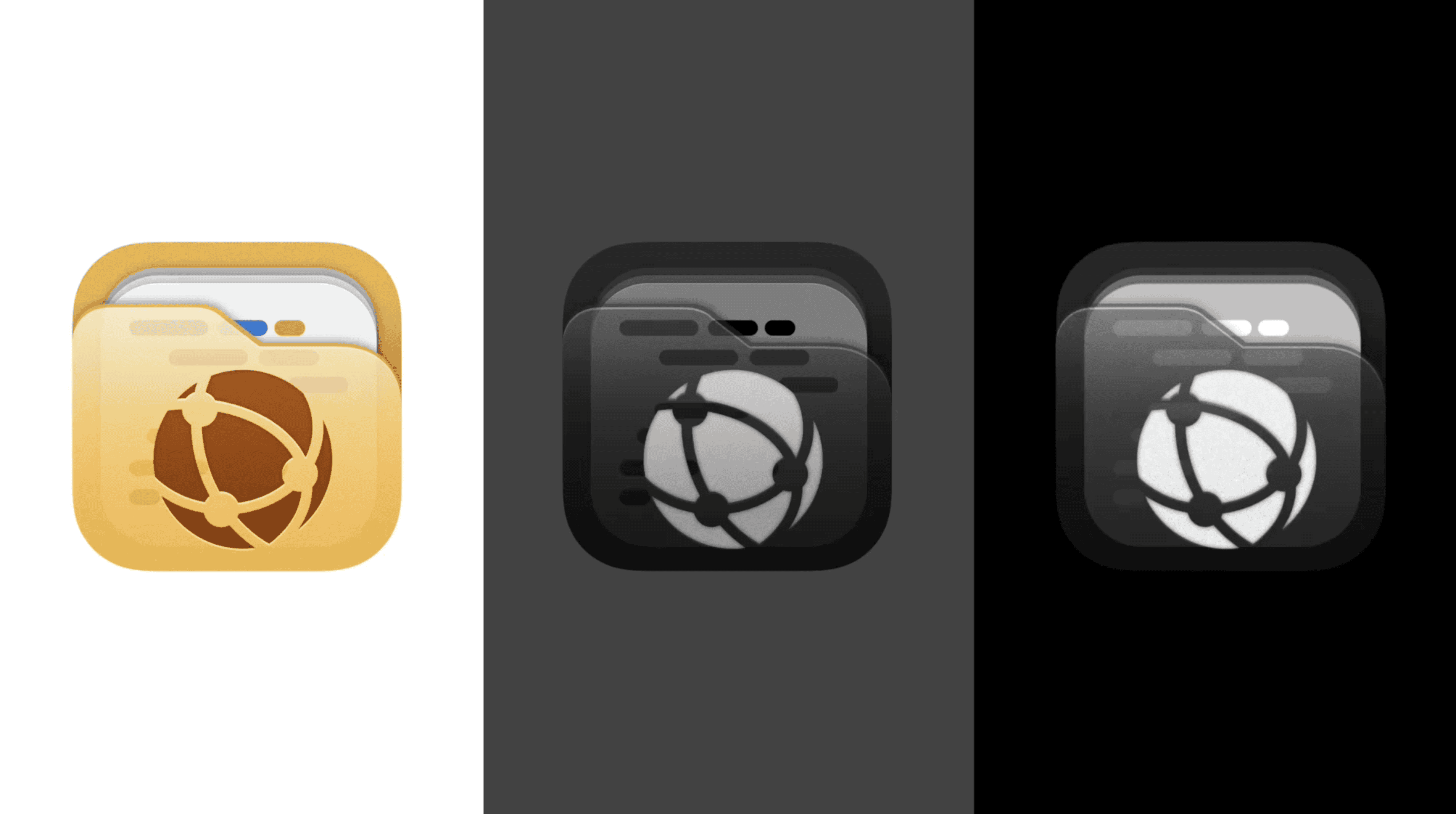
In iOS 18, app icons now have to adapt to both light and dark modes, allowing them to look sharp and cohesive regardless of the system-wide appearance settings. In addition to these modes, Apple has introduced "tinted" icons, which incorporate system-wide accent colors, giving users more personalized control over how their apps appear. This new layer of customization opens up new creative possibilities but also adds complexity to the icon creation process.
The introduction of dark mode, light mode, and tinted icons means app designers now need to provide multiple icon variations for each app. In particular, Xcode 16 now requires three distinct versions of each app icon:
- Light Mode Icon: Optimized for the traditional light background appearance.
- Dark Mode Icon: Designed to look clear and aesthetically pleasing against dark backgrounds.
- Tinted Icon: A flexible version that incorporates system-level accent colors, offering a more dynamic appearance based on user preferences.
Designers will need to ensure consistency across these variations while taking full advantage of the opportunities for personalized user experiences that tinted icons offer.
How to Use the iOS 18 App Icon Template
To make the design process smoother, the iOS 18 App Icon template offers a pre-made solution for quickly generating icons. Here's how to use it:
- Download the Template: Start by downloading the iOS 18 app icon template, which includes smart object layers for light, dark, and tinted modes.
- Design for Light Mode: Begin by creating your icon for the default light mode, ensuring that colors and shapes are clear on a bright background.
- Adapt for Dark Mode: After completing the light mode version, adapt your design for dark mode. This often involves adjusting color contrast and ensuring key details stand out on darker backgrounds.
- Apply Tinted Mode: Finally, design the tinted version of your app icon by allowing for flexible colors that respond to user-set system tints. The template helps you preview how your icon will look across various tint settings.
- Export Your Icons: The template allows for easy export to the required sizes and formats for Xcode 16, ensuring you meet all the necessary technical specifications.
The Benefits of Designing Multiple Icon Variations
Embracing the new requirements of iOS 18, such as creating light, dark, and tinted versions of your app icon, isn't just about meeting Apple's guidelines—it's an opportunity to elevate your app’s visual identity.
Designing multiple variations allows your app to feel more integrated with the system's appearance settings. It enhances usability by providing a seamless experience for users who switch between light and dark modes or use custom tinted themes. This attention to detail not only improves aesthetics but also shows a commitment to user experience, which can translate into higher app engagement and better retention.
Moreover, having flexibility in icon design means you can experiment with styles that communicate your brand more effectively across different environments. Whether users are browsing their home screen in a brightly lit room or scrolling through in dark mode, your app icon will look polished and tailored, which helps your app stand out in an increasingly crowded market.
In short, taking the time to develop these variations isn’t just about compliance—it’s about refining your app’s presence and making a lasting impression.